DRAWINGS
Do You Think You Can Tell #27
Graphite, colored pencil, archival pigmented ink on paper
14 x 11 in
2012
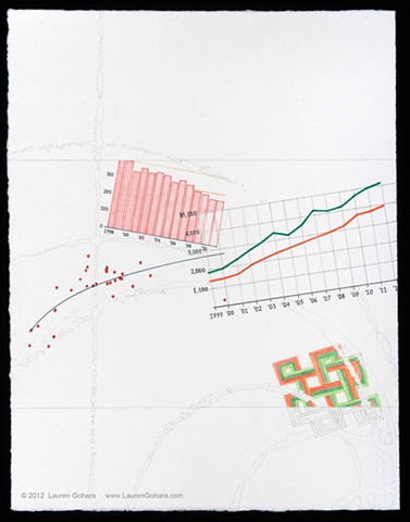
A red dot plot of life expectancy vs health care spending per capita for OECD countries shows the U.S. as the outlier to the far right, with the greatest spending per capita, but with lower than average life expectancy compared with other OECD countries. Above, the bar chart in red shows the decline in companies that offer health insurance coverage to retirees. On the right, the cost to workers of health insurance coverage at small (orange line) and large firms (green line) has more than doubled since 1999. A found graphic of an endless knot in orange and green crosses the lower boundary, which particle physics tracks arc through the background.