PAINTINGS 1 - Economic Inequality
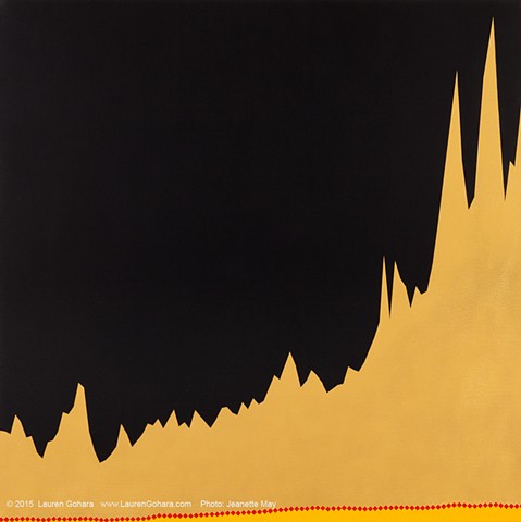
The Rise of the 1% (...and Not Everyone Else)
Oil on canvas
36 x 36 inches
The rise in average income for the top 1% from 1913 to 2011 rises sharply from left to right in gold, while the change in average income for the bottom 99% is marked by the red diamond line creeping along the bottom edge of the painting. The change from 1973 to 2006 has been the most dramatic: for the top 1%, average income rose 190%, while the average income for everyone else rose 8.5%.