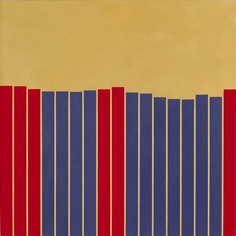
PAINTINGS 1 - Economic Inequality
Against a backdrop of gold, red and purple bars indicate changes in median household income over the period from 1999 to 2015. In 2015, there was a 5% jump in median household income over 2014 (represented by the red bar on the right edge of the painting). The gain after a long period of decline after the Great Recession was cheerily noted in the media. Unfortunately, the $56,516 in 2015 was less than median household income was in 1999 (the red bar on the far left hand edge of the painting), as well as in a few intervening years (4 red bars in between), when adjusted for inflation. Intervening years in which income was less than $56,516 are represented by purple bars. Purple, red, and gold colors were drawn from Prince costumes.
