DRAWINGS
Do You Think You Can Tell #34
Graphite, colored pencil, archival pigmented ink on Japanese paper
8-1/8 x 5-1/2 in
2013
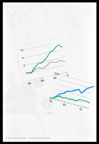
The upper left-hand graph contrasts the rise in GDP per capita (green line) vs the relative flatness in median household income over the same three decades (grey line). In the lower right-hand graph, the rise in manufacturing output per hour (in blue) is contrasted against the change in inflation-adjusted compensation (in green) through the last 2 recessions, revealing a similar relationship as in the GDP vs income graph. A cluster of graphite dots rises from the lower left, as ghostly particle physics tracks swirl and drop down behind.