DRAWINGS
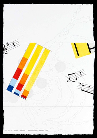
Do You Think You Can Tell #36
Graphite, colored pencil, archival pigmented ink on paper
8-1/2 x 5-3/4 in
2013
In bright colors, a bar chart illustrates the difference between (from left) desired, perceived, and actual share of wealth owned by quintiles of U.S. population, highlighting the actual degree of inequality vs perception. The bright yellow corner of a reproduction of a Mondrian echoes the bright yellow of the top quintile. Fragments of musical notation are scattered through the space, as are dots sketched in graphite. Swelling spirals of ghostly particle physics tracks lie in the background.