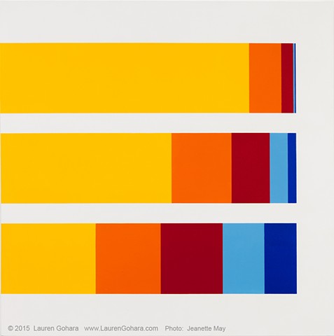
PAINTINGS 1 - Economic Inequality
In a recent study, participants were asked how they thought wealth was distributed between each quintile (economic groups of 20% each) of the population.The wealthiest 20% are in yellow, while the bottom 40% are in light and dark blue. The bottom horizontal bar represents what respondents thought would be a fair distribution. The middle bar shows how people guessed wealth is divided, with the wealthiest 20% owning slightly more than half, while the poorest 40% own roughly 10%. The top bar shows how wealth is actually distributed in America: the wealthiest 20% of Americans hold 84% of the nation’s wealth, while the bottom 40% together own 0.3%.
