DRAWINGS
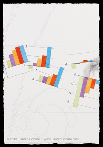
Do You Think You Can Tell #40
Graphite, colored pencil, archival pigmented ink on paper
8-1/2 x 5-3/4 inches
2013
Brightly colored bar charts illustrate the average annual change in family mean income by quintile. Green = lowest 20%, purple = second 20%, yellow = third 20%, red = fourth 20%, and blue = top 20%. From left to right, periods covered are 1969-79, 1979-89, 1989-99, 1999-07, and 2007-12. A lone feathers drifts off the right edge. Ghostly particle physics tracks curl in the background.